

Balmonds
A Natural Evolution for a Beloved Skincare Brand
-
Balmonds has built a loyal following of devoted fans who cherish its beautifully crafted, natural, and environmentally conscious skincare products. As the brand looked to its next phase of growth, the challenge was to support this evolution while staying true to its roots. A key part of this transformation was shifting to more sustainable packaging, including the introduction of aluminium bottles. Balmonds needed a refreshed visual identity—one that would honour its iconic status while embracing the demands of digital marketing, modern retail, and a new generation of skincare enthusiasts.
-
Our process always begins with full immersion in the brand. We engaged with the Balmonds team through workshops, product trials, and discussions to truly understand their values and where the brand could make the greatest impact. Experiencing the products firsthand allowed us to appreciate their sensory qualities—their texture, scent, and effectiveness—which informed our creative direction.
With a strong foundation in place and clear aspirations set, we developed a range of creative routes for Balmonds’ new look. The final identity was shaped through close collaboration with the expert team at Balmonds, ensuring the result was both authentic and impactful. At the heart of this evolution was a deep respect for Balmonds’ core beliefs—celebrating skin positivity, diversity, and the power of nature’s ingredients.
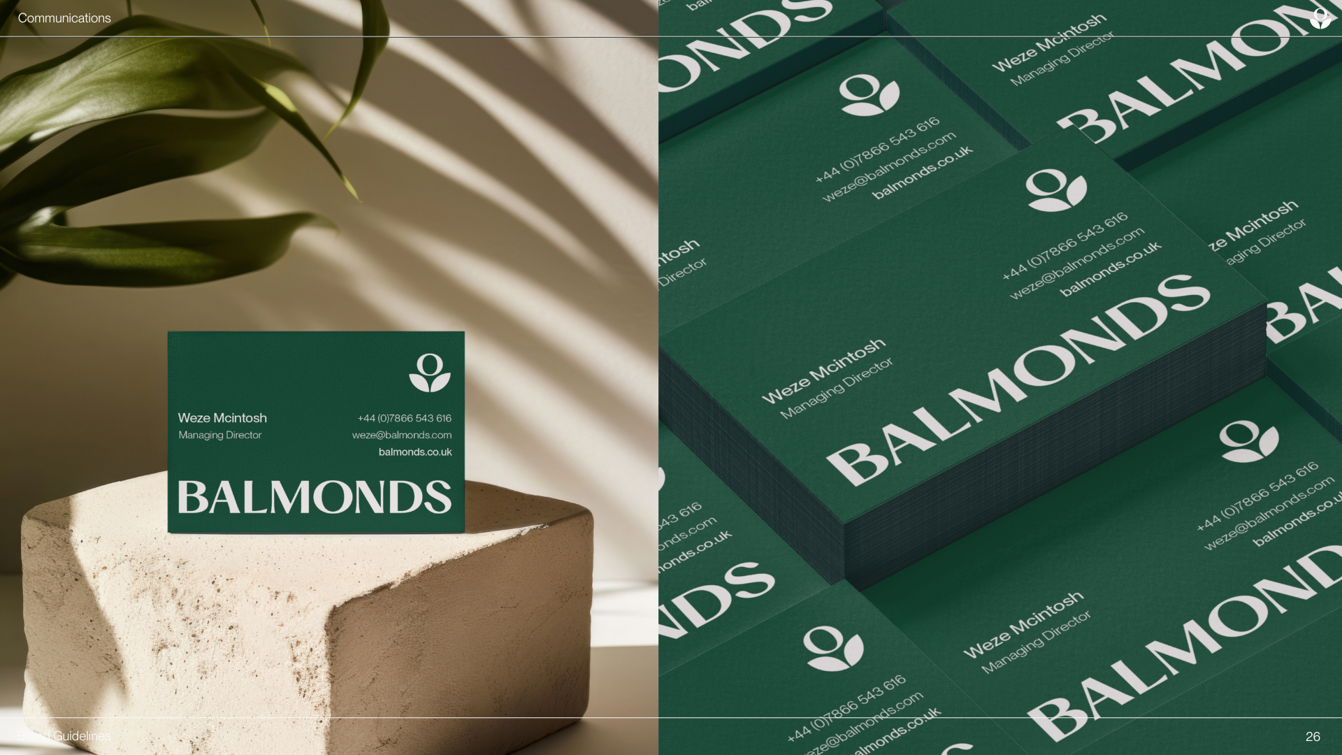
Branding
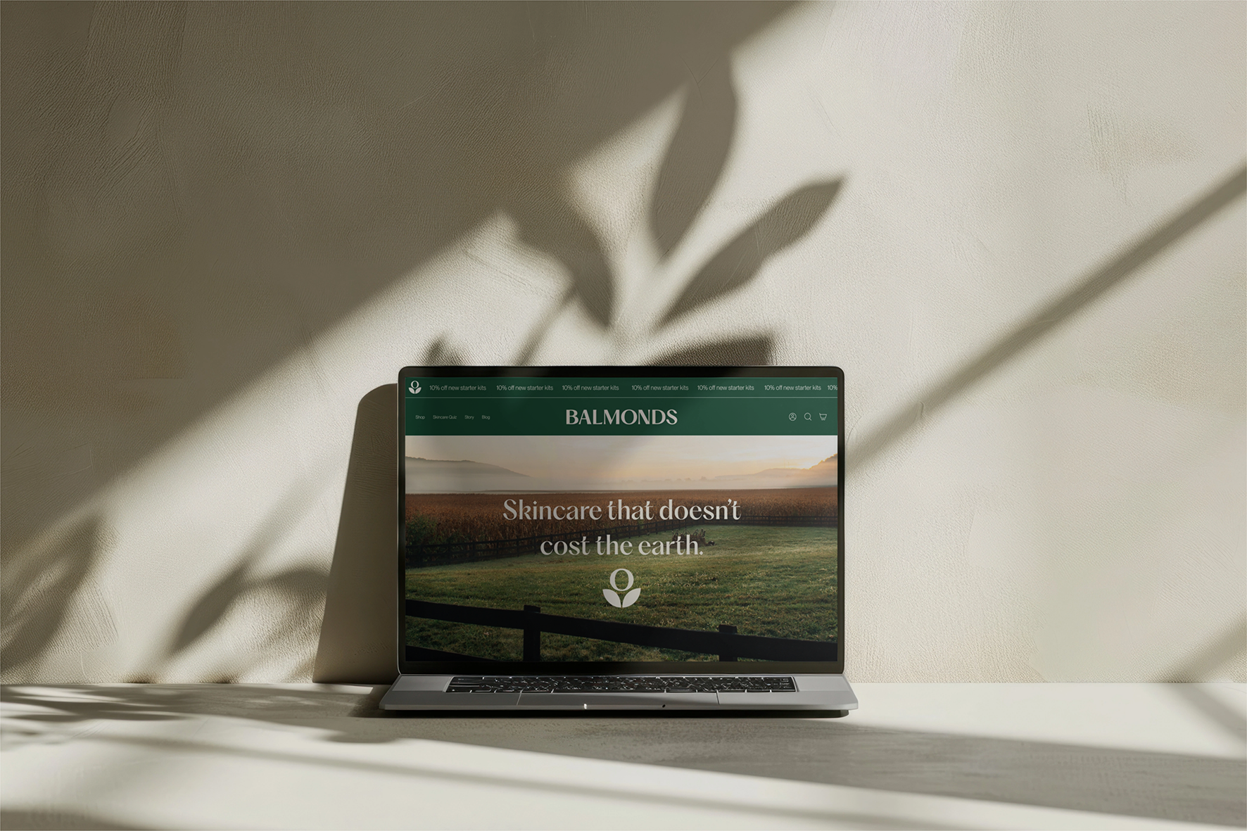
Website styling and assets
Product and packaging
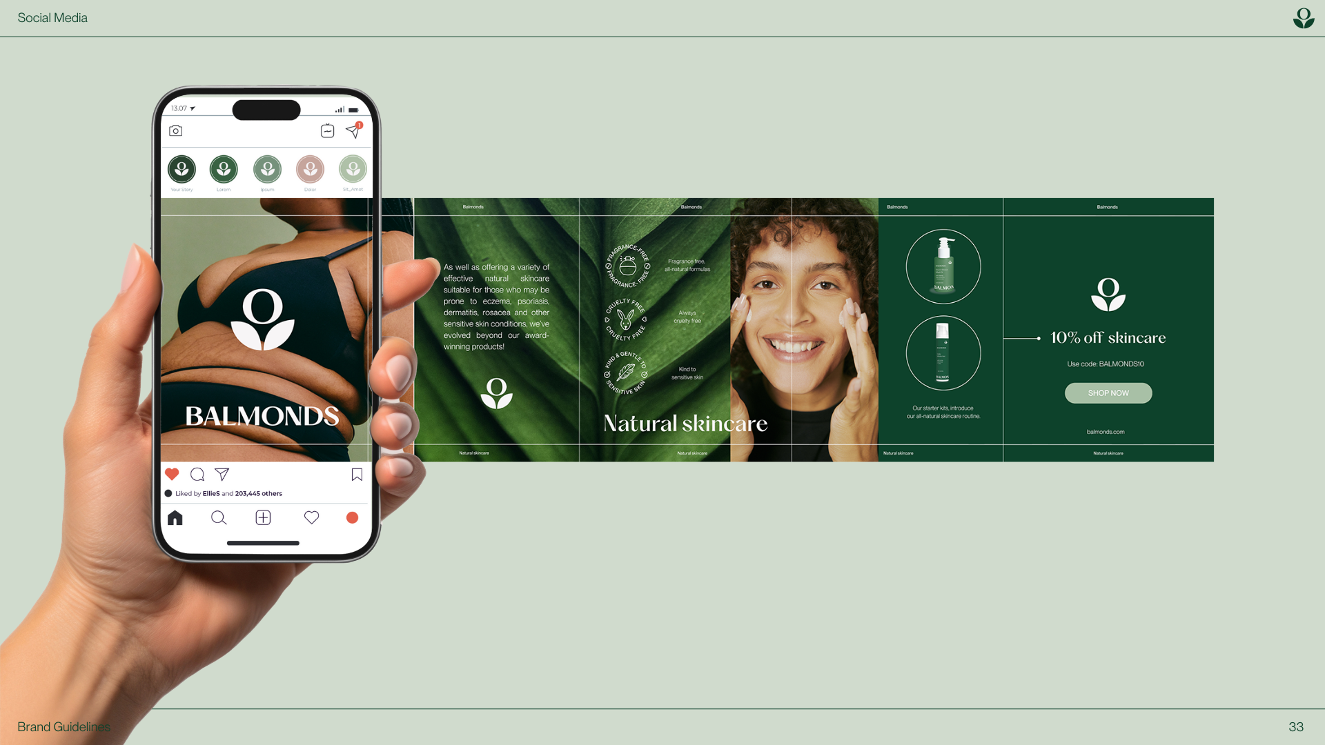
Social media


The Outcome
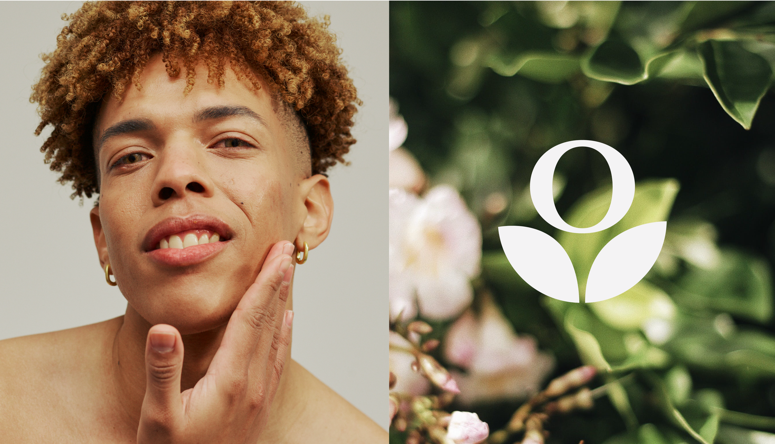
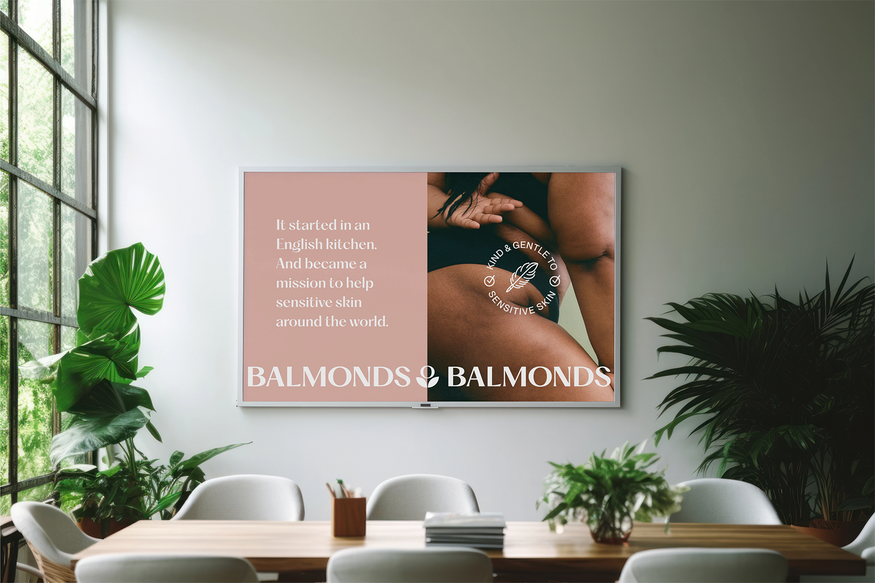
The refreshed brand identity and sustainable packaging capture the essence of Balmonds while setting the stage for its continued growth. The new brand mark embodies the company’s mission to uplift, empower, and support people to bloom while staying rooted in its passion for natural, effective ingredients. A focus on diversity and skin positivity ensures that Balmonds celebrates real skin in all its forms, promoting confidence over perfection.
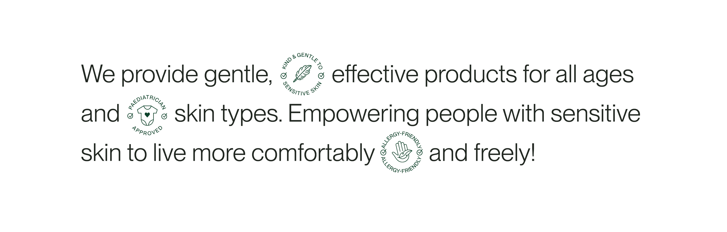
To enhance product clarity, we introduced intuitive claim icons that quickly communicate key benefits and considerations, making it easier for customers to find the right solutions for their skin. The updated photography style reflects Balmonds’ advocacy for skin and age positivity, featuring real people with real skin, highlighting the beauty in every stage of life.
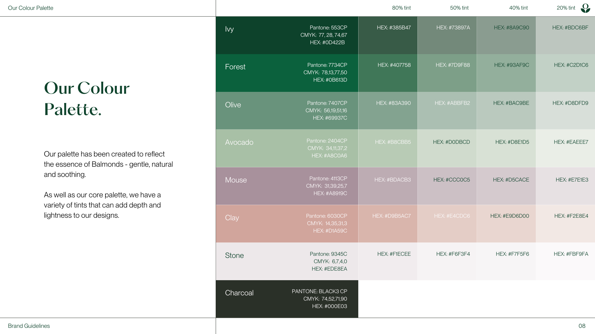
Building on the iconic Balmonds green, the expanded colour palette introduces a spectrum of natural, soothing hues, offering depth and flexibility for future product development. The new modern, minimal packaging design moves away from a purely clinical aesthetic, proving that skincare for sensitive skin can be both functional and visually appealing. Additionally, the brand’s new packaging solutions showcase a commitment to sustainability, with eco-friendly materials such as aluminium bottles and recyclable components designed to reduce environmental impact while maintaining the brand’s high-quality standards.

The KICO Collective team
-
Kirsty Faulkner - Creative lead and brand design
Sule Savas - Design support
Balmonds team - Brand strategy & messaging
