

Sussex Bay
Creating a Disruptive, Heart-Led Service Brand
Branding Strategy
Brand Messaging
Website
-
Sussex Bay is a gateway organisation dedicated to the recovery of our blue ecosystem, connecting, enabling, and accelerating nature restoration projects along 100 miles of Sussex coastline. The challenge was to create a brand identity that clearly communicated this mission—showcasing the critical work being done, engaging the public in marine conservation, and attracting investment to key projects.
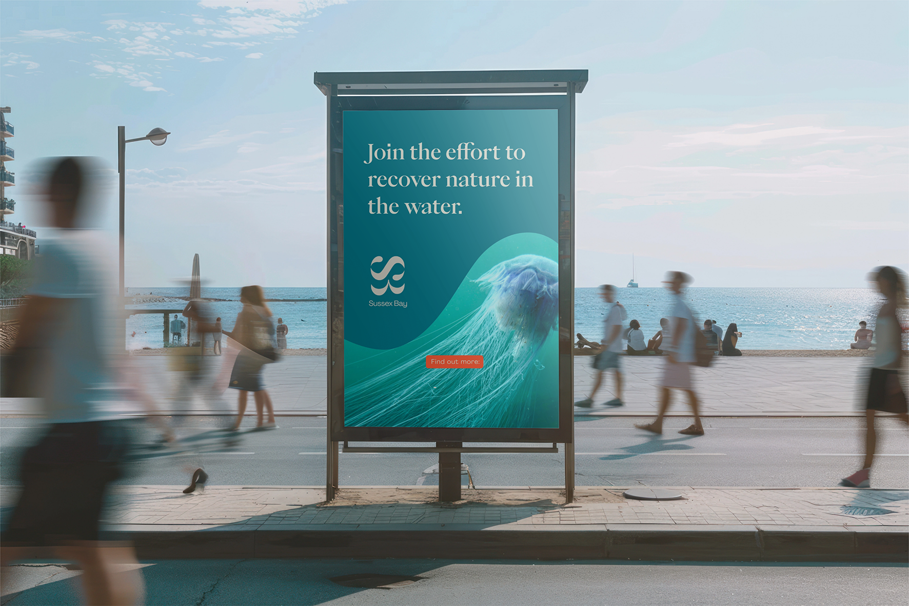
The brand needed to champion and connect nature recovery projects across the coastline, making it clear how they fit together and highlighting the key initiatives leading the way. It also had to communicate complex topics like marine biodiversity uplift in a way that was accessible and engaging for the public. Most importantly, Sussex Bay needed to inspire people to take action—whether by participating in citizen science projects, visiting key restoration sites, or finding ways to contribute to conservation efforts.
-
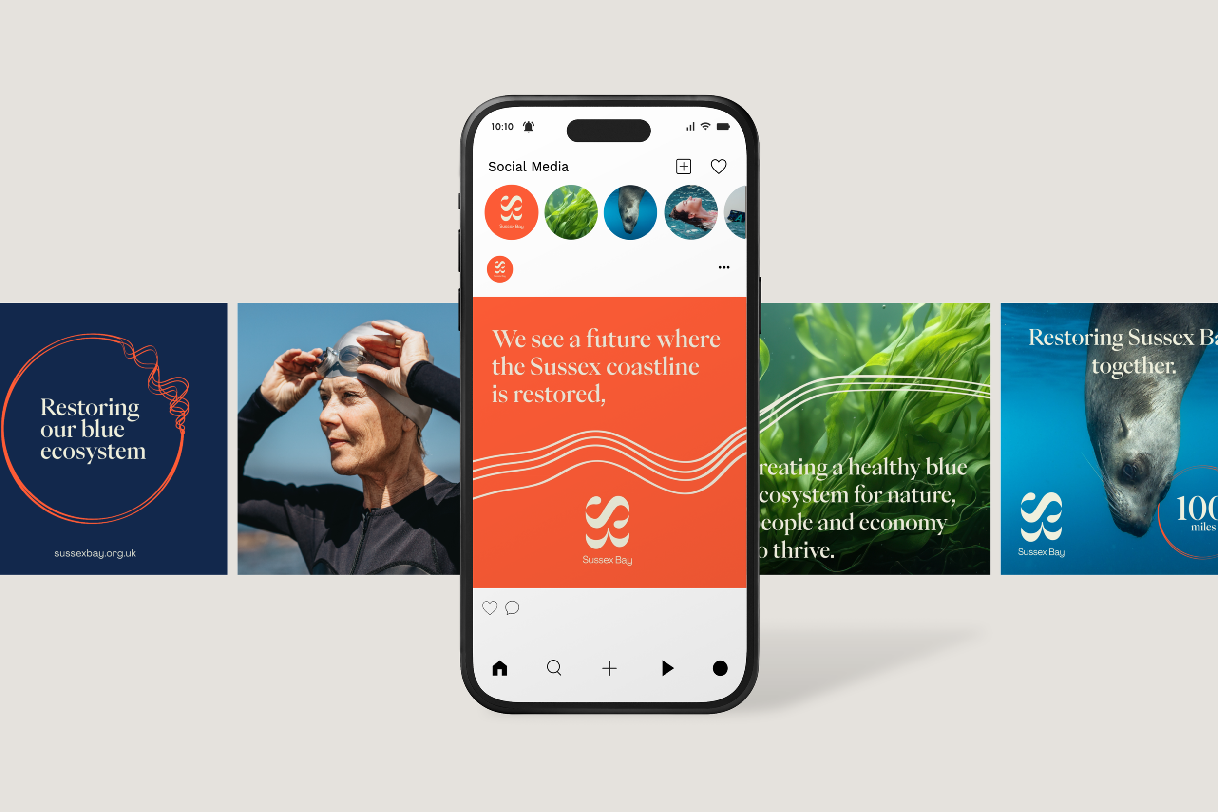
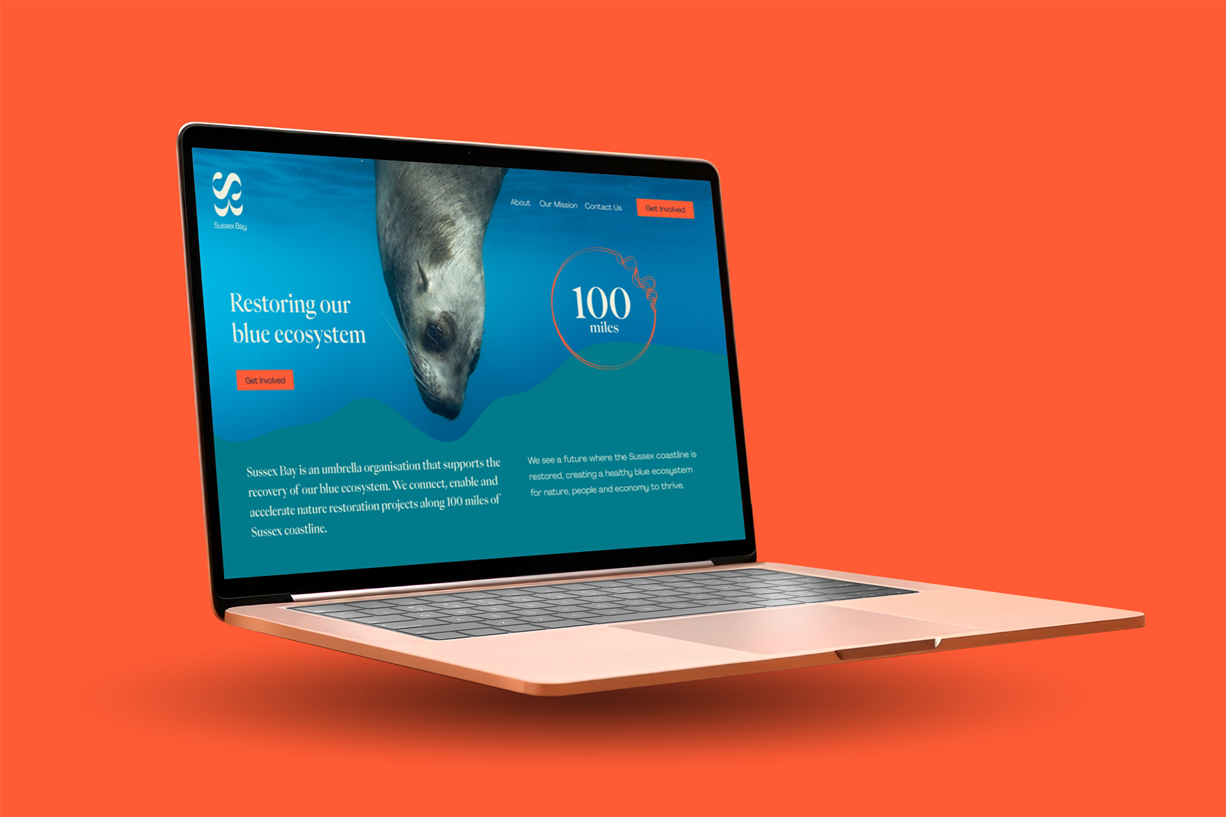
We developed a brand identity that reflects the interconnection of land and sea, humans and nature. Inspired by the dynamic Sussex coastline, the design system was built to be impactful, engaging, and versatile—ensuring Sussex Bay could communicate effectively across different audiences, from conservation experts to the general public.


The Outcome
At the heart of the brand is the Sussex Bay logo, designed to symbolise land and water thriving together. The stylised ‘B’ reflects the shape of Sussex’s two bays, while the ‘S’ above it represents a flowing wave, embodying movement, energy, and the power of the sea.
The colour palette is drawn directly from the Sussex coast—kelp greens, seaweed browns, shell neutrals, and deep ocean blues—creating a natural, harmonious visual identity. A vibrant Buoy Orange acts as the ‘call to action’ colour, helping to highlight key information and drive engagement across digital and physical platforms.
To represent the fragile state of our blue ecosystem, we introduced the Restoration Circle. Its broken edge is fused together with connecting lines, symbolising the restoration efforts taking place along the Sussex coastline. Meanwhile, flowing wave patterns illustrate connection, collaboration, and the ripple effect of positive environmental action.
The Sussex Coastline brand element mirrors the unique shape of the region’s shoreline, extending beyond its borders to reflect a vision that stretches past Sussex to other coastal areas in need of restoration. This element is used to divide content, frame imagery, and reinforce Sussex Bay’s expansive mission.
This powerful visual identity ensures that Sussex Bay can effectively tell its story, inspire action, and build a future where the Sussex coastline is restored—creating a thriving blue ecosystem for nature, people, and the economy alike.

The KICO Collective team
-
Ruth Anslow - Brand strategy & messaging
Kirsty Faulkner - Creative lead and brand design
Sule Savas - Design Support
